
How a Unified Design System Improved Speed and Quality


Overview
This case study highlights my experience improving design systems for previous clients. My focus was on cleaning UI libraries, fixing inconsistent patterns, and creating a shared structure that designers and developers could rely on. I led the structure of tokens, components, and guidelines to bring clarity and consistency across the product.
By building tokens and components from a single source, the team stopped recreating buttons, toasts, and cards from scratch — saving significant time and reducing UI drift.
Problem
When multiple designers work without a shared system, patterns fall apart.
Across projects, I noticed:
Messy file structures and inconsistent UI patterns
Rebuilding of the same components again and again
No single place to understand behavior, states, or usage
Naming confusion and Auto Layout issues that slowed designers and engineers.
Difficulty scaling tokens and components
These issues caused rework, slow handoff, and a fragmented experience.
Scope of Work
I led the restructuring of the design system:
Built foundational tokens
Standardized naming patterns
Organized components into variants
Documented usage rules and behavior
Educated teammates on system adoption
I owned the architecture, cleanup, documentation, and rollout.
Design System Strategy
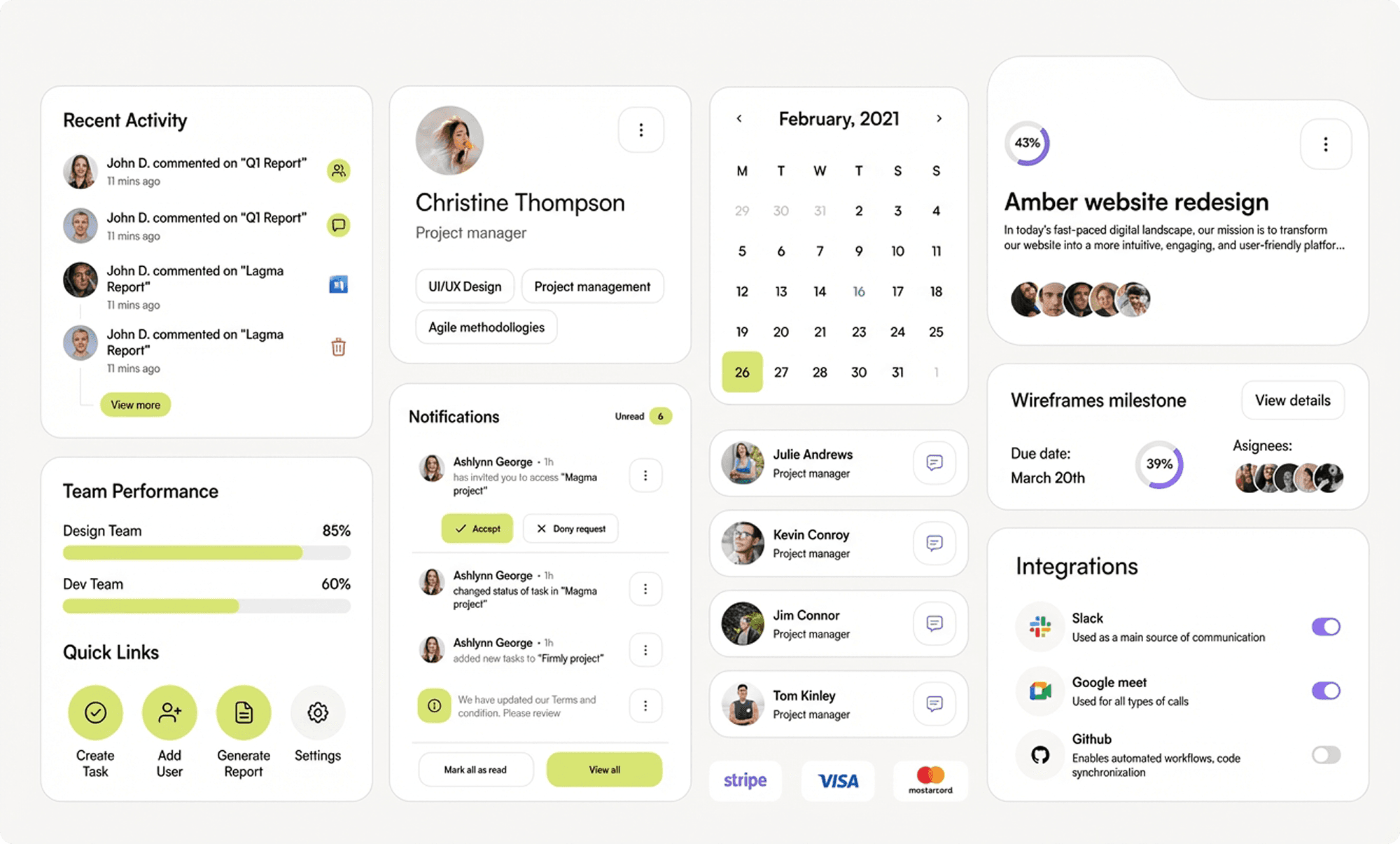
To fix the inconsistency and speed up decision-making, I created a complete, Figma-based design system that included:
Foundations, tokens, usage patterns, and components
A token model aligned with how developers think about variables
Do’s/don’s guidelines and examples directly next to components
A public library shared across projects for consistent updates
Component maps to explain complex structures visually
This reduced confusion, standardized behavior, and made UI updates much simpler.
Token System
I built the system starting with primitives — colors, typography, radius, padding — before moving to semantic and component tokens.
Patterns included:
Color names like purple-500, not raw hex values
Consistent lowercase naming ( ✅button, ❌Button )
Semantic + alias tokens for scalable theming
Component tokens using numeric values for clarity
Scoping and token format easy to find token to apply to the components.
This structure gave clarity to both design and engineering teams.
Components
Components included full-state variants: default, hover, pressed, focus, disabled.
To improve decision-making:
Introduced each states and usage for better design decisions ( hover states for mouse users )
I added icons and text labels inside property controls
Reorganized property order (edit fields at top, booleans in middle, nested items at bottom)
Consistent naming for nested components for text labels, containers for better communication
Created component maps for complex structures
This made components faster to use, easier to understand, and more reliable for handoff.
Impact & Credibility
The updated system resulted in:
40–60% reduction in duplicate components
Faster screen creation (designers saved 20–30 minutes per screen)
Clearer handoff with fewer developer questions
Consistency across all product screens
Faster onboarding for new designers and engineers
The system established one shared language for design, development, and marketing.
Before
Designers recreated components repeatedly, leading to inconsistent styles.
New teammates struggled to navigate the Figma file, and design–dev communication was unclear.
Scaling features and maintaining UI quality became challenging over time.
After
Clear usage instructions helped designers understand where and when to use each component.
Guidelines improved decision-making and sped up the design process.
Designers and developers aligned on one system, producing more consistent and higher-quality UI.

Consistency
75% fewer inconsistent UI patterns
60% reduction in duplicate components
Speed
30–40% faster screen creation
2× faster onboarding for new designers
Handoff & Collaboration
40% fewer design-to-dev questions
100% alignment on tokens & components
Scalability
60% quicker library updates
Reduced UI debt across multiple products
Summary
A strong foundation of tokens, components, and naming patterns made the entire UI feel unified and easier to scale. The library helped every team — designers, developers, and new contributors — work faster and maintain a consistent product experience.
This case study reflects how I build and improve design systems with clarity, ownership, and long-term reliability in mind.